Welcome back to the Streamlabs Ultimate Summer Bod blog series! If you missed part 1, Sean went over the new onboarding flow for Streamlabs Desktop. We’re here with part 2 to give you a sneak peek of an upcoming major Streamlabs Desktop redesign the team has been working on.
My name is Vivian, and I am a designer at Streamlabs, where we help content creators turn their passion into a business. This blog will clarify why we are combining the Editor and Live tabs and explain why we are moving to a vertical navigation bar
Combining Editor and Live
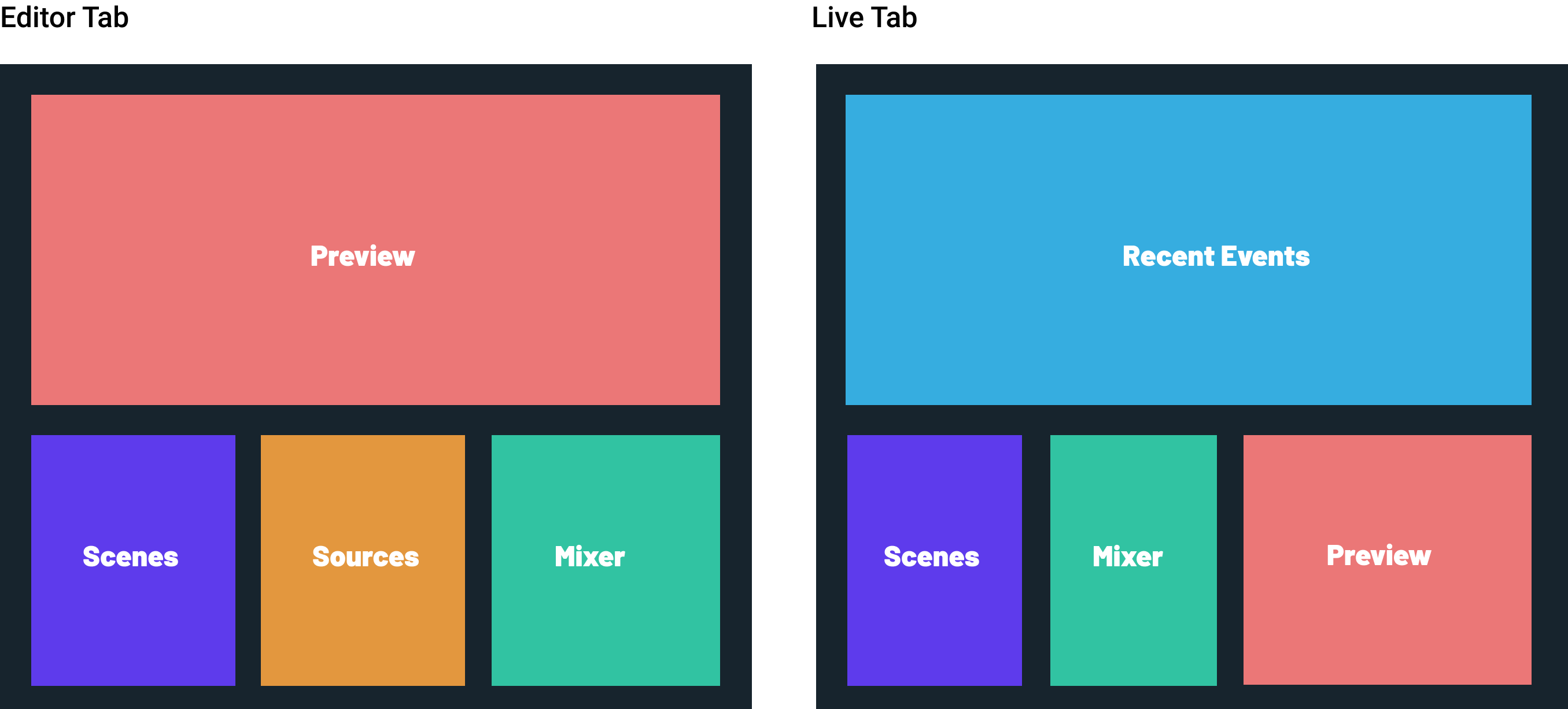
Currently in Streamlabs Desktop, when a user goes live, they will automatically be brought into the Live tab. However, we’ve noticed that a lot of our users tend to stay on the Editor tab even though they’re live. These two tabs are extremely similar, both having the stream preview, a list of scenes, and the audio mixer. So why bother splitting them into two?

The redundancy of these two tabs naturally led to the conclusion that we needed to combine the two into a unified Editor tab. While the idea was simple, it was important to give enough real estate for every feature that our users need.

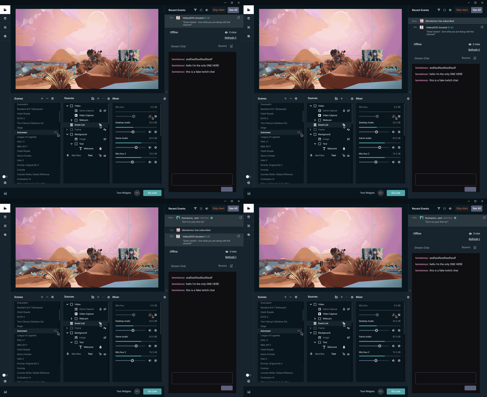
This GIF illustrates a design that we considered; Recent Events acted as a ticker that would push down chat as it increased in length. It seemed like a good compromise between chat size and event list size, however, we realized Scenes, Sources, and Mixer were getting a lot of real estate for no reason. Another issue was that the chat was too small by default. Users provided feedback that chat being at max height was extremely important to them.

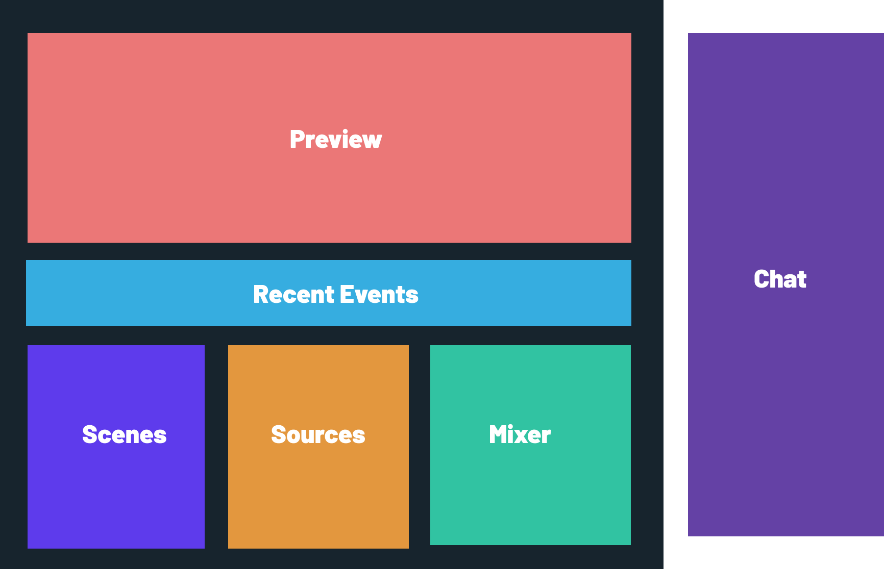
Our final design landed on a combination of elements that prioritizes both a large preview and chat. Recent Events are now displayed under the preview section showing a max of 2–3 events. This will encourage power users to pop it out to take advantage of the full functionality.
Most Streamlabs Desktop users are just regular people like you and me, and may not ever use Recent Events' full functionality. Instead of presenting too much to users who don’t need it, we’re opting for progressive disclosure that balances simplicity and power.
This design eliminates redundant content and reduces the number of steps in the user flow of setting up a stream and going live. This is the all-in-one solution that we strive to be.
Rotating the Navigation Bar
Our current design of the navigation bar has a ton of room for improvement. The most obvious problem is that content is unorganized, and the hierarchy of items in the navigation does not align with usage frequency.

Dashboard -> Cloudbot -> App Store -> Themes -> Editor -> Live
This hierarchy implies that Dashboard is as important as Live, and an example of the Serial Positioning Effect. However, most users just open Streamlabs Desktop, click Live, and stay there.
Another problem was that if a user had even one installed app from our App Store, a new horizontal navigation bar would appear under the primary one. Since most users only have one or two apps installed, the result was a ton of wasted space on the right side of the bar.

Our new design rotated the horizontal navigation bar to a vertical one. Apps will live in a drawer underneath the App Store icon.
The empty space between the navigation tabs and system icons are now fully utilized by app icons! No more wasted space.
We also decided to remove the Dashboard from Streamlabs Desktop. The Dashboard seen in the client is embedded content from the Streamlabs website and isn’t a great experience for users. Moreover, the Dashboard is meant for stream data analysis and did not align with our vision of creating an all-in-one live streaming solution with Streamlabs Desktop. You can still access the Dashboard via Streamlabs.com
Conclusion
These are the most significant changes we are rolling out in an upcoming release, which you can expect to see towards the end of August.
There are plenty of smaller and more minute changes that were not covered in this post, but for the sake of your time, we’re spotlighting the biggest ones we know you’ll care about. We’re happy to answer any questions or concerns you have and are always listening. Let us know your thoughts in the comments below!
Remember to follow us on Twitter, Facebook, Instagram, and YouTube.