Creating perfect subtitles is a world in itself. That's why we'll look at the biggest and most important part of subtitles in this article – choosing the right font!
We might think that subtitles are just text added on top of a video and that's it. But in reality it is much more complicated than that. However with the knowledge you get here and the right settings your subtitles will boost your video in engagement and accessibility and really make the difference.
Before we get into what you should look for in subtitles and give you a curated list of the 15 best subtitle fonts, let us first look at why subtitles are so important in the first place.
Why are subtitles necessary?
Subtitles help your viewers to better understand the video even without any sound turned on. It's proven that subtitles on your videos increase engagement on social platforms. For example more than 80% of people watch a video on Facebook with no sound. So you can use subtitles to differentiate yourself from other videos and make your content more accessible. If you want to learn more about subtitles check out this article.
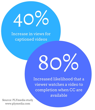
Another advantage that subtitles bring is that they bring strong SEO benefits. YouTube engine can use the subtitles to understand the content of your video and display it accordingly for search queries. This helps you to reach a larger audience since you will not only rank von YouTube's searches but also on Google.
Now that we agree that subtitles are a must and have many advantages, let's take a look at what to look out for.
What's important by adding subtitles to your video?
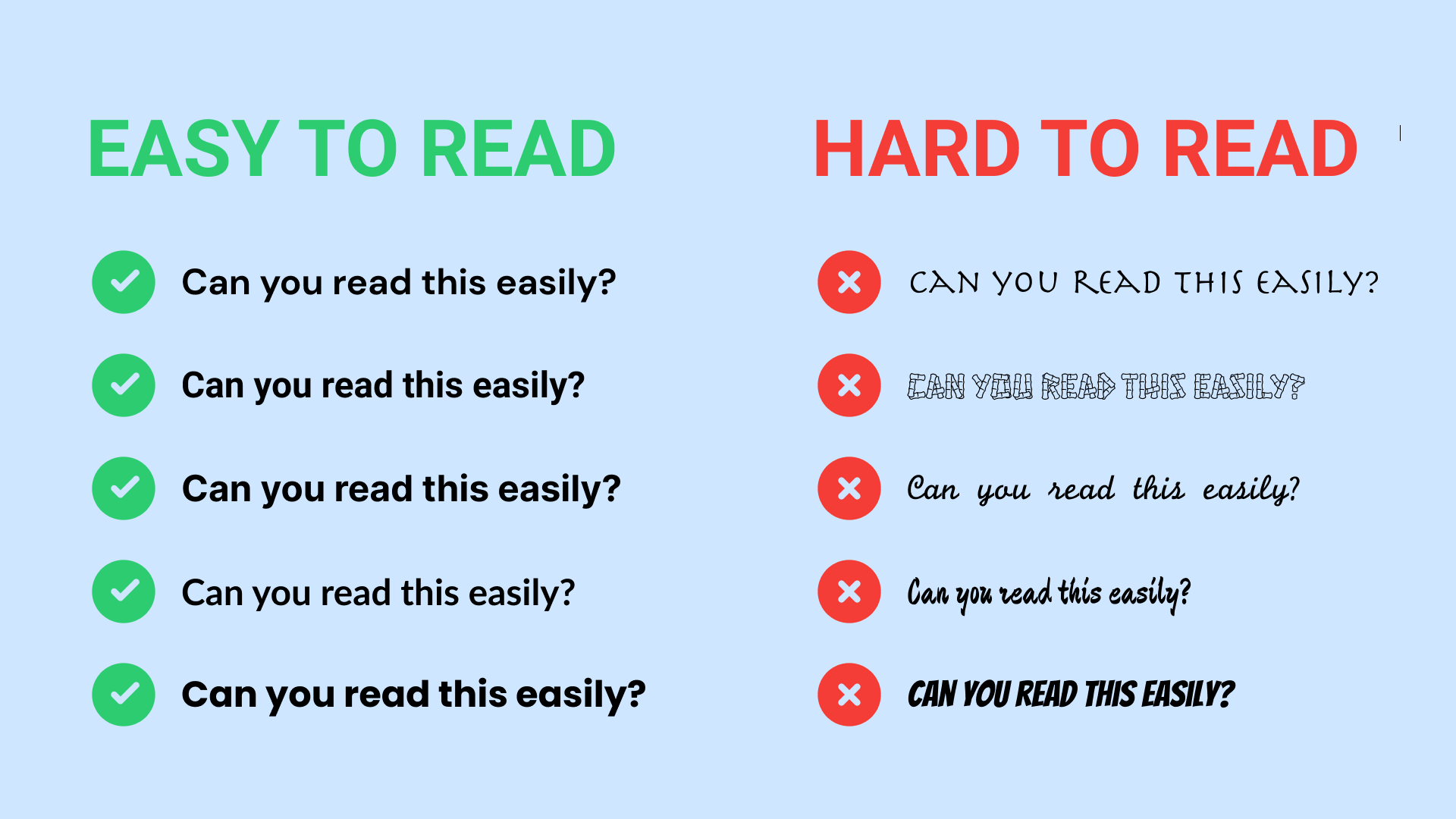
There are three major things to look for in subtitles. Clarity, comprehension and ease on the eye.
1. Clarity
Your goal should always be to provide text that is clear and informative, yet not distracting or impeding of your other visual information on screen. It’s a good idea to customize subtitles with fonts, colors, sizes of your liking but remember that subtitles or captions are not there to distract people from the video but enhance the watch experience.
Therefore the right subtitle font ensures that viewers don’t face trouble understanding the text. That’s why adding subtitles with the right font is the key to creating a rich video experience. The choice of font is the most important decision you have to do by adding subtitles.
2. Comprehension
Your subtitles need not only to be readable but also perfectly synced with the video and perfectly follow the reading skills of your audience. But no worries if you add subtitles with Streamlabs Podcast Editor to your video they will be always perfectly aligned. Our engine automatically transcribes every single word that is spoken with very precise timestamps.
3. Ease on the eye
While there are always some quick tricks like adding outlines or drop-shadow to make text pop out you should make sure that the font and color can be well or poorly readable on different backgrounds of the video.
If the background is much different you should choose a fixed subtitle frame. For example this one. Another important thing is that with different aspect ratios the position of the subtitles should be adjusted. Streamlabs Podcast Editor helps you with the simple drag and drop editor to easily change the position and size.
Let’s take a look at the best types of subtitle fonts from which you can make a good choice.
Top 15 subtitle fonts
#1 Inter
Inter is a variable font family carefully crafted & designed and especially made for computer screens. A very clean and easy to read font. The Inter project is led by Rasmus Andersson, a Swedish font developer.
Inter features a tall x-height to aid in readability of mixed-case and lower-case text. Several OpenType features are provided as well, like contextual alternates that adjusts punctuation depending on the shape of surrounding glyphs.
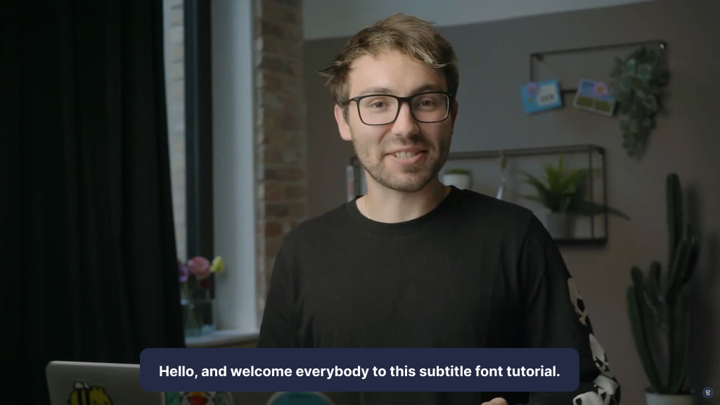
#2 Open Sans
Open Sans is a humanist sans serif typeface and was originally designed by Steve Matterston. Its characteristics are upright stress, open forms, and neutral but approachable appearance. It’s optimized for publishing online, for print, and for mobile. It presents excellent legibility and readability in its type forms. Open Sans is used on some of Google’s web pages and also for online advertisements. Mozilla uses Open Sans as its default typeface for sites until 2019 and for the Telegram desktop app.

#3 Lato
Lato is a typeface belonging to the sans serif typeface family that started in 2010 by Lukasz Dziedzic. The idea behind this font was to create something transparent that when used as part of body text would still display the original characteristics of the typeface even with large typefaces. The semi-rounded letterings give Lato a feeling of warmth. That coupled with the strong structure conveys stability and seriousness. A font that is known but not yet used by everyone as a subtitle.

#4 Archivo
Archivo is a grotesque sans serif typeface family originally designed for highlights and headlines. And thus also perfectly suitable for subtitles. This family is reminiscent of late nineteenth century American typefaces. The technical and aesthetic characteristics of the font are both crafted for high performance typography. It was designed to be used simultaneously in print and online platforms and supports over 200 world languages.

#5 Roboto
Roboto is the default font on Android and most of Google services such as Google Play, YouTube, Google Maps, and Google Images. The advantage here is that most people are very familiar with this font and the readability is extremely high.

#6 Poppins
Poppins is designed by Ninad Kale and Jonny Pinhorn. It is one of the new comers to the long tradition of the sans serif typefaces. With support for the Devanagari and Latin writing systems, it is an internationalist font. Poppins is based on pure geometry and particularly circles. Thus it attracts little attention and is therefore perfect for subtle subtitles

#7 Rubic
Rubik is a sans serif font family with slightly rounded corners designed by Philipp Hubert and Sebastian Fischer at Hubert & Fischer as part of the Chrome Cube Lab project. Rubik is a 5 weight family with Roman and Italic styles, that accompanies Rubik Mono One, a monospaced variation of the Black roman design.

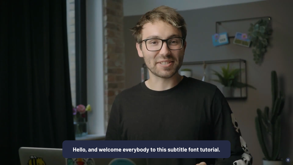
#8 Barlow
Barlow is a slightly rounded, low-contrast, grotesk type family. Drawing from the visual style of the California public, Barlow shares qualities with the state's car plates, highway signs, busses, and trains. This is the Normal family, which is part of the superfamily along with Semi Condensed and Condensed, each with 9 weights in Roman and Italic. The Barlow project is led by Jeremy Tribby, a designer based in San Francisco, USA. To contribute, see
#9 Chivo
Chivo is a new Omnibus-Type grotesque Sans Serif typeface family. The strength of Chivo makes it ideal for highlights, headlines, and subtitles. The regular elegance makes it ideal for continuous reading. If you want to subtitle long videos, this is the font to use.

#10 Verdana
A popular and very modern option, Verdana is a solid choice for projects dealing with technology, innovation or industry. A sturdy serif font, Verdana looks tightly constructed and doesn’t take much unnecessary space at the bottom of the screen for subtitles. If you’re working with short or feature film projects, it’s also seen often with sci-fi type projects. Btw we use this font for our Streamlabs Podcast Editor emails.
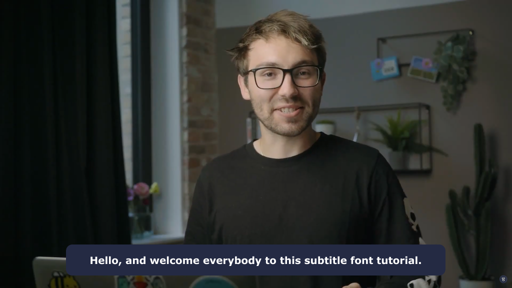
#11 Futura
Futura is a geometric sans-serif typeface designed by Paul Renner and released in 1927. It is still one of the more common fonts. Original it was designed as a contribution on the New Frankfurt-project. It is based on geometric shapes, especially the circle, similar in spirit to the Bauhaus design style of the period. It was developed as a typeface by the Bauer Type Foundry, in competition with Ludwig & Mayer's seminal Erbar typeface. It remains remarkably clear. You might see it pretty often in viral social media videos where text on screen is key
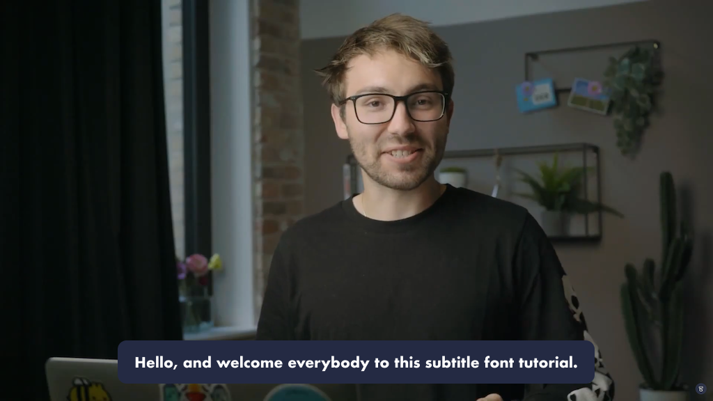
#12 Times
Similar to its brother font, Times New Roman, the Times font is one of the most known and used fonts. It is a serif typeface and was commissioned by the British newspaper The Times in 1931. The reason why it is one of the most popular fonts is that it was one of the "default" fonts of Microsoft World. Even if it's not some people's favorite font anymore, it still helps to be a good subtitle font because of the non-distracting aspect.

#13 Arial
Another simple and safe sans serif font to try out first is Arial. Made as a computer font in neo-grotesque style. In the case of captions and subtitles, you’re not usually looking for anything flashy or distracting. Arial has been a popular pick for years because of its distinctive lack of distinction. The typeface was designed in 1982 by Robin Nicholas and Patricia Saunders.

#14 Noto Sans
The Noto project develops fonts to support all the languages in the world. It is a Sans-Serif Latin, Greek and Cyrillic and Devanagari font family. Maintained by Google. No matter in which language your subtitle should be. With Noto Sans you can't go wrong and always get a good result.

#15 DM Sans
DM Sans is a low-contrast geometric sans serif design, intended for use at smaller text sizes. DM Sans supports a Latin Extended glyph set, enabling typesetting for English and other Western European languages. It was designed by Colophon Foundry. The DM Sans project was commissioned by Google from Colophon, an international and award-winning type foundry based in London (UK) and Los Angeles (US) who publish and distribute high-quality retail and custom typefaces for analog and digital media.

How to add custom subtitle fonts with Streamlabs Podcast Editor
Streamlabs Podcast Editor is a text-based video editor that runs online. It allows you to automatically create subtitles for your video. It's super easy and fast and gives you enough freedom to customize your subtitles and choose your favorite fonts, color and size. Follow these three steps and you will get a great result.👇
#1 Upload your video
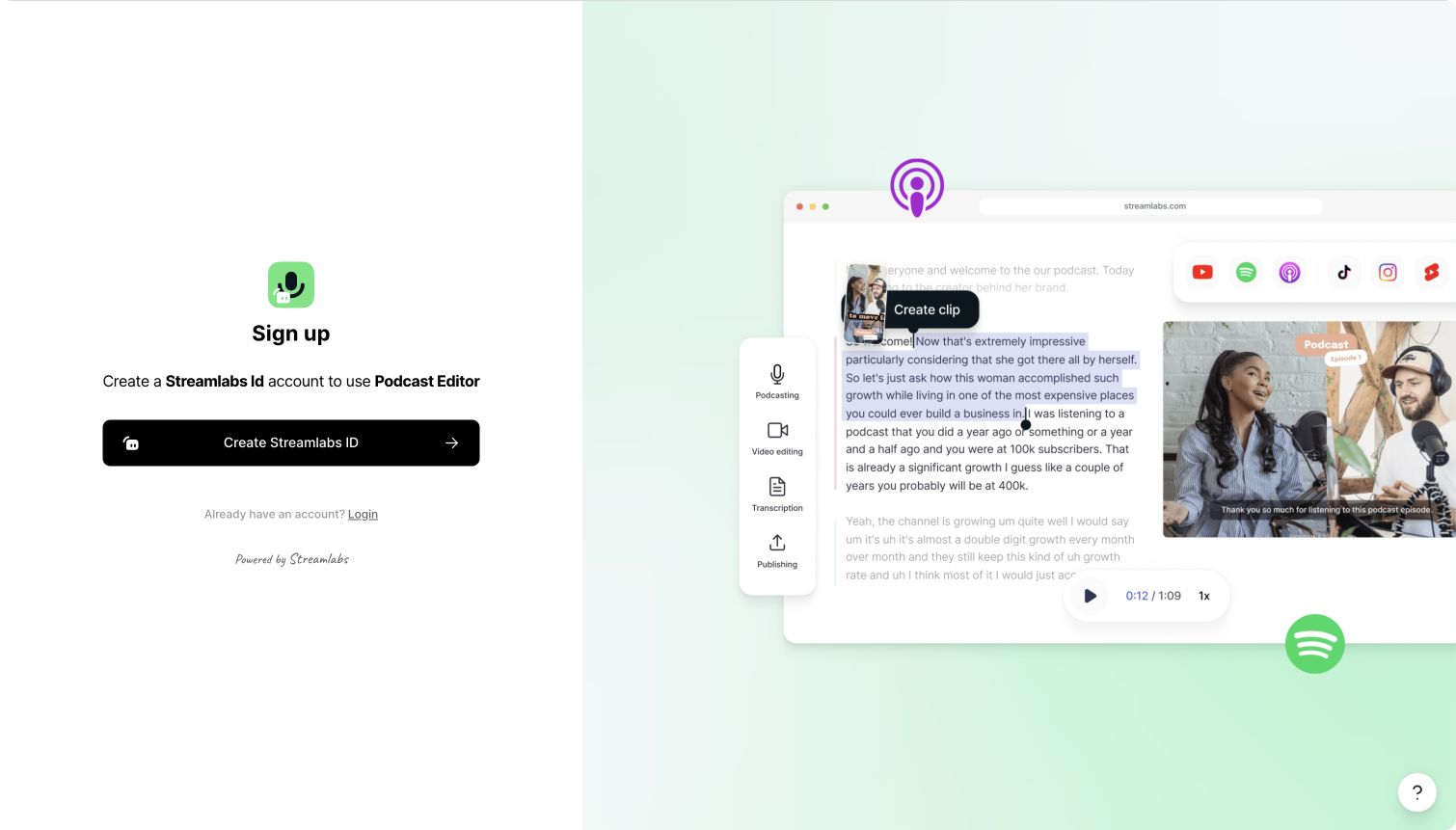
First off all you'll have to go to Streamlabs Podcast Editor's signup page and create an account which takes you literally 1 minute and only requires your name, email and password. You can also signup with you Google account.
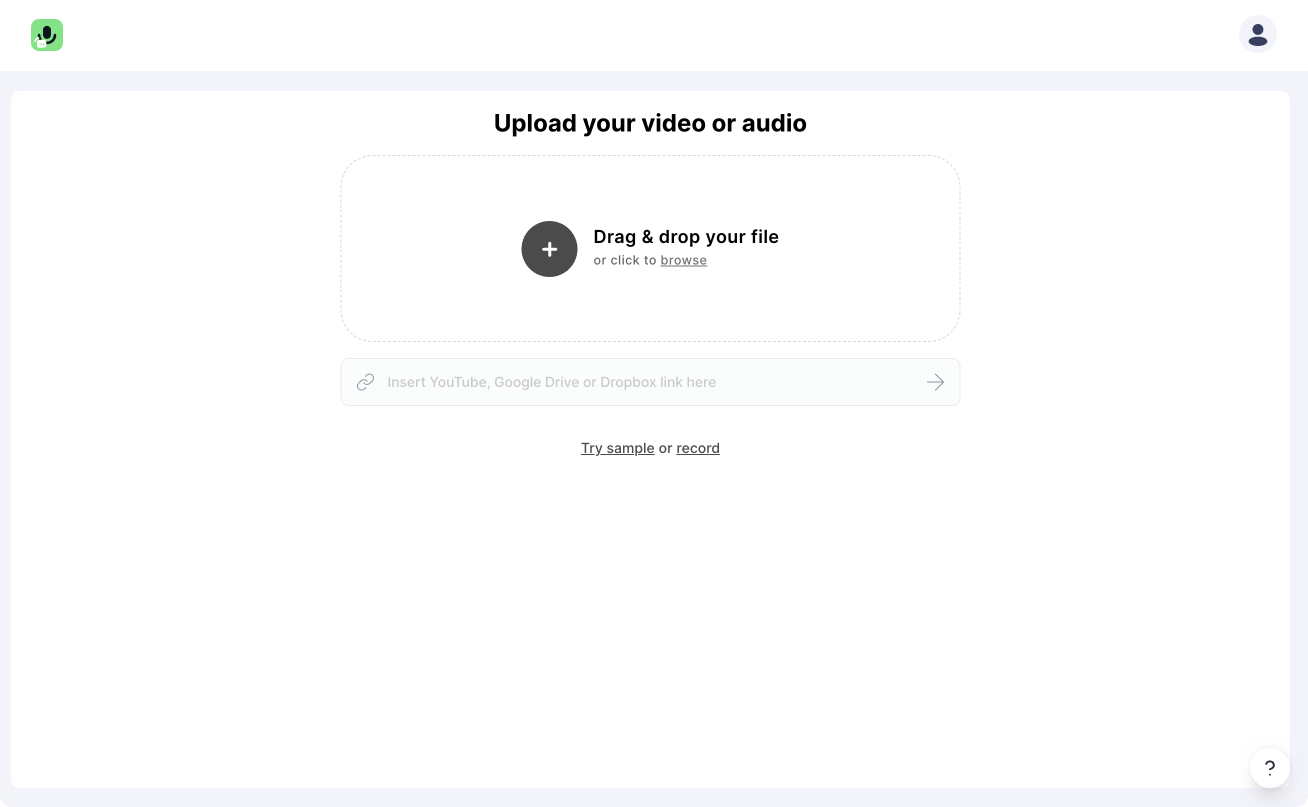
Once you have registered, you can start uploading your video. Simply drag and drop your video from your computer into Streamlabs Podcast Editor. If you want to create a new video, we have built a webcam and screen recorder for you.
#2 Activate subtitles
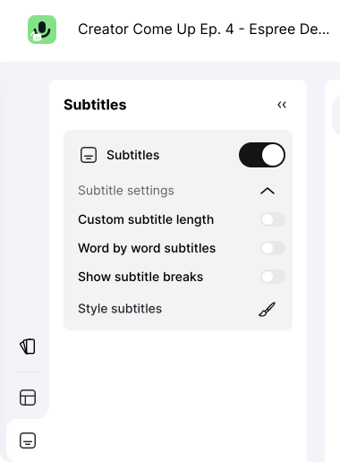
After your video is uploaded and automatically transcribed, you'll land directly in Streamlabs Podcast Editor's video editor. There you can activate the subtitles by clicking on "Subtitles" in the top menu bar. You can either choose between static or dynamic subtitles. Which mean they will be shown up sentence for sentence or will be generated dynamically word by word.
#3 Customize subtitles
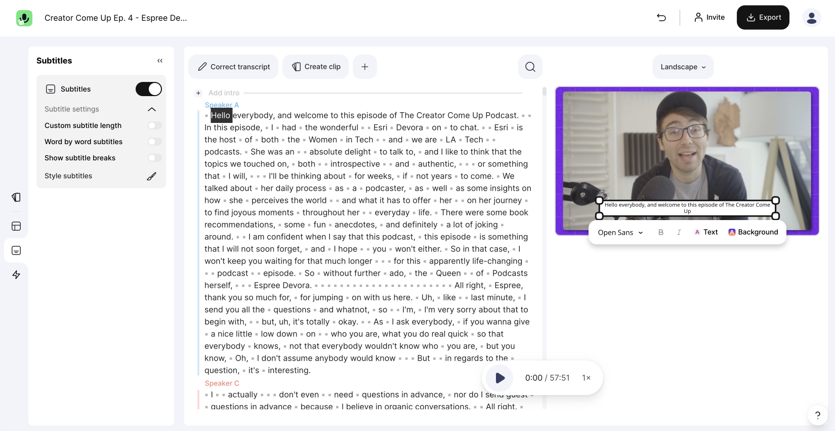
Once the subtitles are activated you can go ahead and give them your favorite styling. Choose from one of the presented or many other fonts. Don't forget to drag and drop them to the right position and also choose a good looking color for the Font itself as well as for the background.
One last thing
If you want to add native subtitles with an SRT file to your YouTube, Vimeo, Facebook, LinkedIn videos you can do so too.